My Cover Looks Like Crap! - Cover Fix 01 - Negative Space
There are so many fabulous book covers out there. And then there are the, um, less fabulous ones. What are the good cover artists doing that the amateurs aren't?
Granted, sometimes the difference is twenty years experience painting fine oil portraits. But so often the fix is not hard at all.
Today I'm going to look at a few examples of covers that make excellent use of white negative space. That's not space that you feel bad about, it's the white around the print and picture. (It doesn't have to be white and not all white covers rely on negative space.)
Here's some gorgeous examples:


Aren't these lovely? All that white, and yet look how much variety there is. In the first example, we have soft, pillowy white...you could just sink into it. The second is icy, hard and claustrophobic. It makes you want to break free. The third is snowy, expansive and hints at a vast, mist-shrouded destiny just over the next hill.... There's an omen of storm and darkness the three small figures must face all alone.
Now let's take a peek at the structure behind the design. Notice the use of thirds.


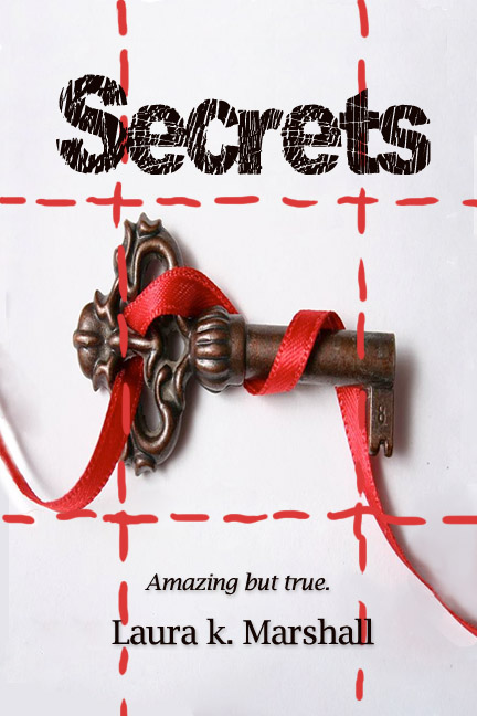
Ok, now how does this help us? Well, now it's time to look at a book that does it wrong. This is a cover off Smashwords. I haven't read it and haven't been asked by the author to fix it. Obviously, it's just my personal opinion that it looks wrong. But here we go:

If you compare this to the covers above, I hope we can agree that it just doesn't look professional.
The question is: Why?
First, let's look at what it has going for it. This cover is not too bad, as indie covers go. The artist has a clear design vision: a simple, symbolic image and a clean, spartan use of white negative space. The red ribbon provides color and diagonal movement to add interest. The font is legible and the title is large enough to read easily.
Yet the final result still looks haphazard, and my sense, correctly or not, is that the artist found a stock image and tossed on some titling. The key has a shadow, but the font doesn't. The author name is shoved into the far bottom left corner. The size isn't so much the problem as the fact that it is so squished into the corner. Sometimes placing a name or title off to one side can balance out another diagonal element in the design, but here, under the centered key, it's not clear why the name is left aligned.
Another problem is that the size of the cover is not standard. Some indie author / artists do this on purpose to make their book "stand out" amongst other books in an online store, but the result, to me, always looks like a mistake, and therefore amateur. It looks amateur here too.


That's the fix. A few simple steps, and the same cover looks much more professional. Maybe you disagree, but I personally wouldn't be able to look at the cover above and immediately peg it as self-published, the way I could with the original version.
Does this cover still have some problems? Maybe. The background is still quite sterile. You'll notice the professional examples have subtle artwork and shading around the edges that give them depth despite the overwhelming white. Another curl of the ribbon might add that extra something-something to this cover.
Another problem, which bothers me more, is that I have no idea what this book is about from the cover--not the genre, nor even whether it's fiction or nonfiction. You'd think that "amazing but true" would indicate a work of nonfiction, but honestly, I have no idea. Secrets about what? The cover doesn't tell us, the title doesn't tell us, the tagline doesn't give a clue.
However, these problems--sterility, ambiguity--are problems to a certain extent with the professional covers as well. It is one of the dangers of the spartan look of white negative space. Especially for fiction--white covers often signal nonfiction.
When I looked at the cover of Destined, the feminine font, common to YA titles, combined with the young girl in a beautiful dress, made me think this was a YA paranormal romance, and I was right, but I certainly wouldn't have guessed it was the story of Psyche and Cupid. I still don't know if it's supposed to take place in ancient Greece (hint: they didn't have sofas like that) or in modern times.
The Harry Potter poster is even worse. It doesn't even spell out the title. They expect you to recognize the font! Of course... I did.
The thing is, if you are an unknown author, you can't expect to have readers know your subject instantly the way millions of Harry Potter fans will. A few more hints would not be awry.
Granted, sometimes the difference is twenty years experience painting fine oil portraits. But so often the fix is not hard at all.
Today I'm going to look at a few examples of covers that make excellent use of white negative space. That's not space that you feel bad about, it's the white around the print and picture. (It doesn't have to be white and not all white covers rely on negative space.)
Here's some gorgeous examples:


Aren't these lovely? All that white, and yet look how much variety there is. In the first example, we have soft, pillowy white...you could just sink into it. The second is icy, hard and claustrophobic. It makes you want to break free. The third is snowy, expansive and hints at a vast, mist-shrouded destiny just over the next hill.... There's an omen of storm and darkness the three small figures must face all alone.
Now let's take a peek at the structure behind the design. Notice the use of thirds.


Ok, now how does this help us? Well, now it's time to look at a book that does it wrong. This is a cover off Smashwords. I haven't read it and haven't been asked by the author to fix it. Obviously, it's just my personal opinion that it looks wrong. But here we go:

If you compare this to the covers above, I hope we can agree that it just doesn't look professional.
The question is: Why?
First, let's look at what it has going for it. This cover is not too bad, as indie covers go. The artist has a clear design vision: a simple, symbolic image and a clean, spartan use of white negative space. The red ribbon provides color and diagonal movement to add interest. The font is legible and the title is large enough to read easily.
Yet the final result still looks haphazard, and my sense, correctly or not, is that the artist found a stock image and tossed on some titling. The key has a shadow, but the font doesn't. The author name is shoved into the far bottom left corner. The size isn't so much the problem as the fact that it is so squished into the corner. Sometimes placing a name or title off to one side can balance out another diagonal element in the design, but here, under the centered key, it's not clear why the name is left aligned.
Another problem is that the size of the cover is not standard. Some indie author / artists do this on purpose to make their book "stand out" amongst other books in an online store, but the result, to me, always looks like a mistake, and therefore amateur. It looks amateur here too.

So the first two things I'm going to do are lose the titles and re-size the cover so that it is a standard size, in this case 6 x 9. I chose 6 x 9 because this is a good size to use if you want to take your book to print through a service like Create Space.

Next, I check the image size against a grid, to see that is not hogging space or lopsided. One thing that you need if you're going to have a cover with negative space is actual space. I decide that the key image is still too large, so I make it smaller.
That's not quite as easy as it sounds. The image is not 6 x 9 and when I fit it onto a 6 x 9 canvas, I have edges. The ribbon doesn't continue on to the sides of the cover. Extending the off-white background (which is important because true white would be too sterile) is easy, but extending the ribbon is tricky. In PhotoShop, I use Healing Brush for the background and Cut-Paste-Healing Brush a piece of the ribbon to make new ribbon where I need it.
There are three standard lines on a book cover: Title, Author, and Tagline. Sometimes there's also a subtitle or review quote. This book has just the standard three, which is fine.
I experiment with several different fonts for the title and author. My first instinct was to chose an ornate font for the title, to match the ornate, old-fashioned key. However, the key sticks up right where the capital S naturally falls, which makes ornate fonts with a fancy S look awkward. Instead, I settle on blockier font, without any shadow, as if it were scratched onto the page the key sits upon. I chose a simple font for the Author name, and the italic version of the same font for the Tagline.

That's the fix. A few simple steps, and the same cover looks much more professional. Maybe you disagree, but I personally wouldn't be able to look at the cover above and immediately peg it as self-published, the way I could with the original version.
Does this cover still have some problems? Maybe. The background is still quite sterile. You'll notice the professional examples have subtle artwork and shading around the edges that give them depth despite the overwhelming white. Another curl of the ribbon might add that extra something-something to this cover.
Another problem, which bothers me more, is that I have no idea what this book is about from the cover--not the genre, nor even whether it's fiction or nonfiction. You'd think that "amazing but true" would indicate a work of nonfiction, but honestly, I have no idea. Secrets about what? The cover doesn't tell us, the title doesn't tell us, the tagline doesn't give a clue.
However, these problems--sterility, ambiguity--are problems to a certain extent with the professional covers as well. It is one of the dangers of the spartan look of white negative space. Especially for fiction--white covers often signal nonfiction.
When I looked at the cover of Destined, the feminine font, common to YA titles, combined with the young girl in a beautiful dress, made me think this was a YA paranormal romance, and I was right, but I certainly wouldn't have guessed it was the story of Psyche and Cupid. I still don't know if it's supposed to take place in ancient Greece (hint: they didn't have sofas like that) or in modern times.
The Harry Potter poster is even worse. It doesn't even spell out the title. They expect you to recognize the font! Of course... I did.
The thing is, if you are an unknown author, you can't expect to have readers know your subject instantly the way millions of Harry Potter fans will. A few more hints would not be awry.
Comments
I guess many of the other readers and writers could share such examples too? And many of them would agree with my opinion that for some of my books many authors must use their own illustrations? I guess if I hired a professional artist for some of my works then probably my Mountaineers would be clean-shaven, the mermaids’ hair would get wet all the time, the Brown faces would look like the Afro-Americans of today (and all the readers and critics would accuse me of being racist), etc. Of course, every rule has its exceptions, there are amateur illustrations and covers that look awful. But I’m certain all the readers and critics, writers have similar experience like mine with many professional artists’ works?
I hope what I find doesn't make me go *gack*
Now like everyone else, I'll be taking a second look at the cover of my upcoming release.
Here's hoping my cover artist has read this post as well!
El