My Cover Looks Like Crap! - Cover Fix 02 - Text As Art
Let's say you have to make a cover on the cheap. You're an indie author, for instance, and you foolishly blew your cover art budget on a bowl of instant ramen noodle. Tsk tsk tsk. Always thinking with your stomach!
Your first plan was to hire Stephan Martinière to paint an original scene from your novel. That fell through when you found out it would cost more than your monthly mortgage payment. So now you're back to making your own cover.
Anyway, you figure, no biggie. You don't need a scene from your novel anyway. What could be simpler than throwing the title over a moody picture and calling it a day? Lots of covers are no more than text over a vague scenic background or abstract pattern... right?
Right!
But if you want to go this route, you have to realize two things:
1. You'll be using text as art.
2. That's a lot harder than it sounds.
So you can't just slap your title up in Times New Roman or Papyrus and expect that to look good. In a sense, you need an even BETTER grasp of basic design principles if you are going to rely on text and font to do your work for you.
First, let's look at some examples where it's done with elegance and aplomb.

Wow, isn't the simplicity of this cover amazing? It's minimalist, including only title and author, and there's no image at all, except the frown created by the text itself and the bright yellow color. Because the yellow smiley face is an icon, this cover works against our expectations, exactly as the subject itself does.
By the way, this is also a terrific use of negative space.
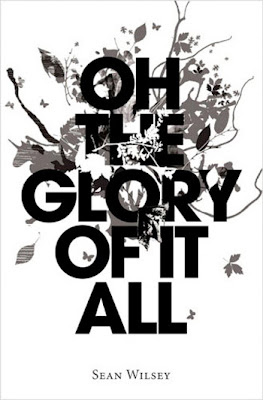
Again, this cover has only title and author. The title takes up most of the cover. Look closely and you'll see that the artwork behind the text, despite the subtle grayscale tones, is quite complex. Notice how it is not completely behind the text either, but occludes the lettering in places. At first, it seems to be nothing but leafy scribbles, but study it. Do you see the butterflies? The unicorn?

I love the ambiance of this cover, and the way it moves smoothly from cool oceanic colors to warm, atmospheric colors. Yet the light pink sky darkens just enough at the top edge and corners to balance the darkening of the bluish hues below. Title & author are all that appear, as in the two previous examples. The others used only two different fonts. Notice--this one uses three. That's fine, because there's nothing messy or unplanned here, despite the casual, script-like fonts for the title. Do you notice how the letting in the title also moves from warm to cool colors?
Also, the author's name is done right: drop shadow, spacing, font, everything is clean and crisp.
The first time I looked at this, I took the lower pattern to be waves... I was completely taken in by the optical illusion, brought on by partly by the title, and partly by the iconic nature of sun-sets-over-the-sea photos, that I was looking at a stylized ocean under a setting sun. Only as I looked a second time did I see that the ocean is actually made of coins. How intriguing....
By the way, this was a self-published book which was later picked up by a traditional publisher. This was the original, self-published, cover.


Here's a cover which has a layer of text which fills the whole cover...and behind it, pale so as not to compete directly, an image of a girl and a shadow. (Notice her eyes are carefully placed so they are not obscured, however, and also that they hit the two thirds mark.)
The broken font fits the theme of the book, hinted at by the title. The author name is so tiny that a bit of red has been added to make it stand out more. This is one of the few times that a red stroke around text is not a bad idea.
By the way, when you block out the thirds of the cover, look how nicely FOR GOT TEN works out:

Imagine that!

Here's a more complicated cover.
As in our other examples, the main "image" is the title itself, in a disturbed, unsettled font. In addition, however, we also have a lot of other information on this cover. There's the name of the series ("Chaos Walking," the fact that it's Book Two, and, in case some people still didn't get it, the written reminder that this is the sequel to The Knife of Never Letting Go.
But wait, there's more. We also have the main picture image, of five persons on horseback. A sky with two moons. A lot of crazy-weird scribbled words like "Todd" and "Germs" and "Over" which make no sense, but are disturbing and unsettling, just like the main font (though these are in a different "handwritten" font). The author's name risks being lost in that mess, so it's picked out in red.
All the books in this trilogy have fairly long titles. A design like this, which gives the lion's share of the cover to the title rather than to a scene or a portrait, works well with long titles. Notice that the title takes up almost the entire top two thirds of the cover, and the other cover information takes up the rest.

As before, I will now take a random book cover off Smashwords and, utterly uninvited (and unpaid), redesign it.
Here's what I've chosen as my sacrificial victim:


I have a sense the author was trying to make the text do more work here than it's doing. The letters have been manipulated quite a bit. There's a red stroke around them, and three layers and some sort of white reflection. It's built up, but never amounts to much. The red and white letters look too bold against the soft mauves and peaches of the background, yet also intimidated by the image because the title and author name are too small.
As usual, my first step is to erase the original font. I wouldn't normally need to do this, obviously, since I would be starting with a clean royalty-free image.

The cover is already the correct ratio of 6 x 9. That's good. Nonetheless, I play around with resizing the image in various ways because the trees are just a bit awkwardly placed. Eventually, I zoom in, flip the image horizontally and reduce it to 72% opacity.


Voila! That's today's book cover fix.
Your first plan was to hire Stephan Martinière to paint an original scene from your novel. That fell through when you found out it would cost more than your monthly mortgage payment. So now you're back to making your own cover.
Anyway, you figure, no biggie. You don't need a scene from your novel anyway. What could be simpler than throwing the title over a moody picture and calling it a day? Lots of covers are no more than text over a vague scenic background or abstract pattern... right?
Right!
But if you want to go this route, you have to realize two things:
1. You'll be using text as art.
2. That's a lot harder than it sounds.
So you can't just slap your title up in Times New Roman or Papyrus and expect that to look good. In a sense, you need an even BETTER grasp of basic design principles if you are going to rely on text and font to do your work for you.
First, let's look at some examples where it's done with elegance and aplomb.

Wow, isn't the simplicity of this cover amazing? It's minimalist, including only title and author, and there's no image at all, except the frown created by the text itself and the bright yellow color. Because the yellow smiley face is an icon, this cover works against our expectations, exactly as the subject itself does.
By the way, this is also a terrific use of negative space.

Again, this cover has only title and author. The title takes up most of the cover. Look closely and you'll see that the artwork behind the text, despite the subtle grayscale tones, is quite complex. Notice how it is not completely behind the text either, but occludes the lettering in places. At first, it seems to be nothing but leafy scribbles, but study it. Do you see the butterflies? The unicorn?

I love the ambiance of this cover, and the way it moves smoothly from cool oceanic colors to warm, atmospheric colors. Yet the light pink sky darkens just enough at the top edge and corners to balance the darkening of the bluish hues below. Title & author are all that appear, as in the two previous examples. The others used only two different fonts. Notice--this one uses three. That's fine, because there's nothing messy or unplanned here, despite the casual, script-like fonts for the title. Do you notice how the letting in the title also moves from warm to cool colors?
Also, the author's name is done right: drop shadow, spacing, font, everything is clean and crisp.
The first time I looked at this, I took the lower pattern to be waves... I was completely taken in by the optical illusion, brought on by partly by the title, and partly by the iconic nature of sun-sets-over-the-sea photos, that I was looking at a stylized ocean under a setting sun. Only as I looked a second time did I see that the ocean is actually made of coins. How intriguing....
By the way, this was a self-published book which was later picked up by a traditional publisher. This was the original, self-published, cover.

The artwork is literally beaded into the title. This is another two-font title, with the BLACK overlapping the purple HEART. The author name uses yet a different font (or possibly a variation of the font used for Heart) and the boast line ("New York Times Bestselling Author") yet another font. Normally, you want to be leery of too many fonts, but in this case, they are close enough and conservative enough that nothing jars. Besides, there's little on the cover besides text, so font fun is not a distraction... it's the main event.
It goes without saying (I hope) that the artistry it took to integrate the beaded portraits with the font requires considerable talent.

This cover looks deceptively simple at first glance. The cover looks almost white. (Originally, I was going to use this as an example in my negative white space post.) Peer deeper and the reeds in the misty lake gradually resolve. Notice too, the smudges around the title. This may have come with the font, but this is not a font you'll find preloaded on your computer. Font artists deserve to be paid like everyone else, and buying fonts can cost anywhere from $30 to $150 to $5000. There are also free fonts you can download.
Did you notice "A NOVEL" in white down there in the gray mist?

Here's a cover which has a layer of text which fills the whole cover...and behind it, pale so as not to compete directly, an image of a girl and a shadow. (Notice her eyes are carefully placed so they are not obscured, however, and also that they hit the two thirds mark.)
The broken font fits the theme of the book, hinted at by the title. The author name is so tiny that a bit of red has been added to make it stand out more. This is one of the few times that a red stroke around text is not a bad idea.
By the way, when you block out the thirds of the cover, look how nicely FOR GOT TEN works out:

Imagine that!

Here's a more complicated cover.
As in our other examples, the main "image" is the title itself, in a disturbed, unsettled font. In addition, however, we also have a lot of other information on this cover. There's the name of the series ("Chaos Walking," the fact that it's Book Two, and, in case some people still didn't get it, the written reminder that this is the sequel to The Knife of Never Letting Go.
But wait, there's more. We also have the main picture image, of five persons on horseback. A sky with two moons. A lot of crazy-weird scribbled words like "Todd" and "Germs" and "Over" which make no sense, but are disturbing and unsettling, just like the main font (though these are in a different "handwritten" font). The author's name risks being lost in that mess, so it's picked out in red.
All the books in this trilogy have fairly long titles. A design like this, which gives the lion's share of the cover to the title rather than to a scene or a portrait, works well with long titles. Notice that the title takes up almost the entire top two thirds of the cover, and the other cover information takes up the rest.

As before, I will now take a random book cover off Smashwords and, utterly uninvited (and unpaid), redesign it.
Here's what I've chosen as my sacrificial victim:

I chose this cover because it has a lovely image and a vivid title. Also, I'm a cat person.
Right now, it isn't too bad, but it doesn't look professional. Can we improve it? Let's give it a shot.

I have a sense the author was trying to make the text do more work here than it's doing. The letters have been manipulated quite a bit. There's a red stroke around them, and three layers and some sort of white reflection. It's built up, but never amounts to much. The red and white letters look too bold against the soft mauves and peaches of the background, yet also intimidated by the image because the title and author name are too small.
As usual, my first step is to erase the original font. I wouldn't normally need to do this, obviously, since I would be starting with a clean royalty-free image.

The cover is already the correct ratio of 6 x 9. That's good. Nonetheless, I play around with resizing the image in various ways because the trees are just a bit awkwardly placed. Eventually, I zoom in, flip the image horizontally and reduce it to 72% opacity.

This is going to work better with the title when I embigger the font size. (Dr. Suess says "embigger" is a word.) After a bunch of experiments with font, I decided to use two different fonts for the title. I chose a funky font for SNOW: !Y2KBUG.

...but I don't like how it looks with the word CAT. I can barely read the word. Plus, it's hitting the tree. Bleg.
I choose a more whimsical, feline font for CAT (2Peas Goofball). I have the two words of the title on two different layers in Photoshop so I can move Cat out of the way of the tree. Sometimes every single letter needs its own layer, but fortunately, that's not necessary here.
I'm not sure at first if I want to re-use either font again elsewhere, but I try out the whimsical font on the Author, and it looks cute, so I keep it.
Next, I add font bling. I add a distant, distinct drop shadow to both words. For SNOW, I include a 3 pt white stroke. And I give both words a white glow, to help them stand out from the background. I gave the author name a much tighter, more subtle drop shadow. The author name also has a stroke around it, but the same color as the font itself, just to thicken it.
By the way, I chose the font color by poking my eyedropper around the canvass until I found a deep mauve that stood out against the lighter sky, yet still blended into the hues of the image.

I could stop here. I think it looks better than before. It's simple and sweet. But I can't leave well enough alone... I would like to give more of a hint about what the book is about. I read the description of the book and create a logline: "The forest animals are protected."
Okay, maybe not the greatest logline of all time, but combined with the title, I think this at least opens up a few questions... protected by whom? From whom?
Also, perhaps unadvisedly, I decided to experiment with extending the font into a bit of doodling, just for fun... and to illustrate the principle of Text As Art.

Earlier, I
removed the fact that this is by Gypsy Shadow Publishing, because I'm
not sure that needs to be on the cover, but hey, maybe I could put it
back on.
Something is still missing.
Magic!
The genre, I note, is fantasy... I gather that the Snow Cat is a magical protectorof the forest animals. Let's see if we can add some sparkly pixie kitten dust!

Comments